

How to Create Stunning Data Visualizations in Python: Top 10 Techniques to Learn
- vikash Singh
- Jan 23
- 5 min read


In this guide, you’re going to learn some of the coolest and most popular visualization techniques, one plot at a time, using the mpg dataset in Python.
Whether you’re interested in visualizing univariate (histograms), bivariate (scatter plot) or multivariate (heatmaps) variables, we’ve got it all covered here in this guide.
We’ll start by loading the `mpg` dataset from Seaborn, and before you know it, you’ll be the Picasso of Python plots.
So lets get going!
Dataset
First things first, we need to grab the `mpg` dataset. Think of this dataset as a collection of cool cars from the 1970s and 80s.
It’s a nostalgic look at how much fuel (miles per gallon) these cars guzzled.
import seaborn as sns
import pandas as pd

# Load the mpg dataset from seaborn
mpg = sns.load_dataset('mpg')

# Display the first few rows to get a feel of the data
mpg.head()
Output:

Boom! We’ve got a dataset full of horsepower, cylinders, and other engine-sort-of-things!
Lets start creating some cool visualizations, mate!
Chart 1: Scatter Plot
The first stop is the scatter plot, which shows the relationship between two numerical variables. So, this is a bivariate (two-variable) visualization plot.
Let’s visualize the relationship between horsepower and miles per gallon (mpg).
import matplotlib.pyplot as plt

# Scatter plot of horsepower vs mpg
sns.scatterplot(x='horsepower', y='mpg', data=mpg)

plt.title('Horsepower vs. MPG: Faster Cars, Thirstier Engines?')

plt.show()
Output:

You’ll notice that the higher the horsepower, the lower the mpg.
That’s not a big surprise, isn’t it? More speed, less mileage — the classic trade-off.
Chart 2: Line Plot
A line plot is great for showing trends over time. Let’s plot the average mpg by `model_year`. Basically we are trying to visualize the trend in efficiency (`mpg`) over the years.
# Line plot showing trend of mpg over the years

sns.lineplot(x='model_year', y='mpg', data=mpg)
plt.title('MPG Over the Years: The Race for Fuel Efficiency')
plt.show()
Output:

Looks like that as time went on, manufacturers finally improved upon the mileage levels they were offering to the customers.
Makes sense because you would not want to stop at gas stations every 10 miles!
Chart 3: Bar Plot
Bar plot can be used to plot the frequency of levels of a categorical variable. For example, consider the number of cylinders in these cars.
Let’s use a bar plot to see the mileage across different cylinder counts (the categorical variable here).
# Bar plot of cylinders vs average mpg

sns.barplot(x='cylinders', y='mpg', data=mpg)
plt.title('Cylinder Count vs MPG: More Cylinders, More Fuel?')
plt.show()
Output:

You can infer from the above bar plot that higher number of cylinders in the car means lower mileage.
Chart 4: Histogram
Histograms are used to visualize the distribution of the numerical variable. So, this is a univariate (one-variable) visualization plot.
The code below will show us how `horsepower` is distributed across the dataset — whether it is normally distributed, or is there some skewness.
# Histogram of horsepower

sns.histplot(mpg['horsepower'].dropna(), bins=20, kde=True)

plt.title('Distribution of Horsepower: More Muscle, Please!')

plt.show()
Output:

The peaks and valleys in this plot make you wonder where all the 500-horsepower monsters are hiding. I guess they’re reserved for race tracks.
Chart 5: Box Plot
A box plot shows the spread of any numerical variable, such as `mpg`, individually, or with respect to another variable, such as the number of cylinders, as shown in the code below.
It is super useful in visualizing outliers because along with the important statistics of the variable, it also plots the outliers — also called whiskers.
# Box plot of mpg grouped by cylinders

sns.boxplot(x='cylinders', y='mpg', data=mpg)

plt.title('MPG by Cylinder Count: Fuel Efficiency by the Numbers')

plt.show()
Output:

What you’re seeing in the output is the visual representation of mpg summary statistics for each cylinder count.
The black dots (whiskers) represent the outliers.
Chart 6: Pie Chart
Pie charts give you a “slice of the pie” view of your data. It helps in slicing the distribution of various labels in a categorical variable.
For example, let’s visualize how many cars in the dataset came from USA, Europe, and Japan.
# Pie chart for car origins

origin_counts = mpg['origin'].value_counts()

# Plotting the pie chart

plt.figure(figsize=(7,7))

plt.pie(origin_counts, labels=origin_counts.index, autopct='%1.1f%%', startangle=140, colors=['skyblue', 'lightgreen', 'lightcoral'])

plt.title('Pie Chart: Distribution of Cars by Origin')

plt.show()
Output:

Each slice of the pie represents percentage distribution of cars from different regions. It turns out that most of the cars in our dataset (63%) are from the USA, with Japan and Europe sharing the rest of the pie.
Chart 7: Pair Plot
If you want to visualize how multiple variables relate to each other, pair plot is a great way to do that.
So, this is an example of multi-variate (many-variables) visualization plot.
Let’s see that in action when we compare `mpg`, `horsepower`, `weight`, and `acceleration` all at once.
# Pair plot of mpg, horsepower, weight, and acceleration

sns.pairplot(mpg[['mpg', 'horsepower', 'weight', 'acceleration']])

plt.suptitle('Pair Plot: Relationships Between Key Features', y=1.02)

plt.show()
Output:

Wow, have a look at that! A plot party with scatter plots and histograms, all in one. It’s like these variables are dating!
Chart 8: Heatmap
We have seen in one of the previous plots what a scatterplot does, which basically helps in visualizing the relationship between two numerical variables.
But what if we want to visualize correlation between multiple variables. It’s a quick way to see what’s related.
Again, this is an example of multi-variate (many-variables) visualization plot.
For example, how are the variables, weight , mpg , acceleration, and horsepower .
Time to find out.
# Correlation matrix

corr = mpg[['mpg', 'horsepower', 'weight', 'acceleration']].corr()

# Heatmap of correlations

sns.heatmap(corr, annot=True, cmap='coolwarm')

plt.title('Heatmap: Correlation Between Variables')
plt.show()
Output:
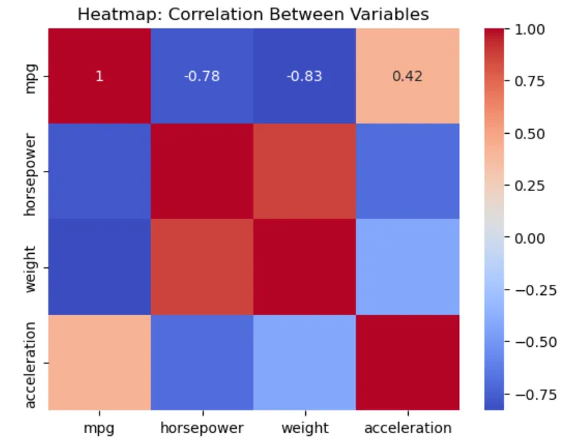
Turns out, heavier cars tend to have higher horsepower, and lower mileage.
Chart 9: Joint Plot
Joint plots are a combination of scatter plots and histograms. So they provide the best of both worlds.
Let’s plot `weight` against `mpg` and see the relationship between the two.
# Joint plot of weight vs mpg

sns.jointplot(x='weight', y='mpg', data=mpg, kind='scatter')

plt.suptitle('Joint Plot: Weight vs MPG')

plt.show()
Output:

Notice the cool addition of histograms on the sides?
Now we have the bivariate relationship between the two variables, through the scatterplot; but also have univariate distributions through the histogram.
Chart 10: Stacked Bar Plot
A stacked bar plot shows how different categories stack up on top of each other.
In this case, we’ll visualize the count of cars by the number of cylinders, stacked by the car’s origin.
# Pivot table for the stacked bar plot

stacked_data = mpg.pivot_table(index='origin', columns='cylinders', aggfunc='size', fill_value=0)

# Plotting the stacked bar plot

stacked_data.plot(kind='bar', stacked=True)

plt.title('Stacked Bar Plot: Cylinder Count by Origin')

plt.xlabel('Origin')

plt.ylabel('Count of Cars')

plt.legend(title='Cylinders')

plt.show()
Output:

In the output, you can see how cars manufactured in different regions (USA, Europe, Japan) stack up by cylinder count.
Conclusion
And that’s it. There you have it!
Ten awesome visualization techniques using Python, which will take your visualization game to the next level.
All explained one-by-one using the `mpg` dataset.
Whether you’re exploring scatter plots or playing it classy with joint plots, you’re now equipped to wow your audience with some killer visualizations.
Begin plotting! Because its not just about the analysis, its also about how you show it off!
I hope you had as much fun reading this as I did writing it. Stay tuned for more data adventures!
Collection of other blog can be found here.
You can also connect with me on LinkedIn.
Happy Learning!


Comments